來聊聊怎麼建構UI

前言
昨天大致上的介紹了一下Jetpack Compose的用法,基本上可以稍微辨識建構整個UI邏輯的方式,接下來這個章節要談的會是UI元件具體有哪些,然後可以怎麼用。
那參考的reference基本上就是官網。
然後這邊也稍微會用AI整理所有的元件可以怎麼使用,那我們就開始囉~
正文
基本元件
Text
用於顯示文本。
Text(text = "Hello, Jetpack Compose!")Button
可點擊的按鈕。
Button(onClick = { /* Do something */ }) {
    Text("Click Me")
}
Image
用於顯示圖片。
Image(painter = painterResource(id = R.drawable.my_image), contentDescription = "My Image")Icon
用於顯示圖標。
Icon(imageVector = Icons.Default.Home, contentDescription = "Home Icon")佈局元件
Column
垂直排列子元件。
Column {
    Text("First item")
    Text("Second item")
}
Row
水平排列子元件。
Row {
    Text("First item")
    Text("Second item")
}
Box
可以堆疊子元件。
(就是Flutter的Stack)
Box {
    Text("Background text")
    Text("Foreground text")
}
LazyColumn
用於顯示長列表,類似於 RecyclerView。
(iOS的TableView)
LazyColumn {
    items(100) { index ->
        Text("Item #$index")
    }
}
LazyRow
水平滾動列表。
(iOS的CollectionView)
LazyRow {
    items(100) { index ->
        Text("Item #$index")
    }
}
輸入元件
TextField
用於輸入文本。
var text by remember { mutableStateOf("") }
TextField(value = text, onValueChange = { text = it })
Checkbox
用於選擇或取消選擇。
var checked by remember { mutableStateOf(false) }
Checkbox(checked = checked, onCheckedChange = { checked = it })
Switch
用於開關選擇。
var switched by remember { mutableStateOf(false) }
Switch(checked = switched, onCheckedChange = { switched = it })
高級元件
這邊就會用到比較多除了佈局或基礎之外的元件,很多時候在佈局的時候,可能外面需要包一層這些物件,你會比較輕鬆的可以做出精緻的UI:
Card
Card {
    Text("This is a card")
}
Scaffold
用於構建應用程序的基本結構,例如包含 AppBar、Drawer、FloatingActionButton 等。
(Flutter的Scaffold)
Scaffold(
    topBar = { TopAppBar(title = { Text("Scaffold Example") }) },
    content = { Text("Content goes here") },
    floatingActionButton = {
        FloatingActionButton(onClick = { /* Do something */ }) {
            Icon(Icons.Filled.Add, contentDescription = "Add")
        }
    }
)
Snackbar
顯示短暫的消息。
Scaffold(
    snackbarHost = { SnackbarHost(it) },
    content = { paddingValues ->
        val snackbarHostState = remember { SnackbarHostState() }
        val coroutineScope = rememberCoroutineScope()

        Button(onClick = {
            coroutineScope.launch {
                snackbarHostState.showSnackbar("This is a snackbar")
            }
        }) {
            Text("Show Snackbar")
        }
    }
)
AlertDialog
用於顯示對話框。
var openDialog by remember { mutableStateOf(true) }

if (openDialog) {
    AlertDialog(
        onDismissRequest = { openDialog = false },
        title = { Text(text = "Title") },
        text = { Text("This is an alert dialog") },
        confirmButton = {
            TextButton(onClick = { openDialog = false }) {
                Text("OK")
            }
        },
        dismissButton = {
            TextButton(onClick = { openDialog = false }) {
                Text("Cancel")
            }
        }
    )
}
Navigation
用於在不同的組件之間導航。
val navController = rememberNavController()

NavHost(navController, startDestination = "home") {
    composable("home") { HomeScreen(navController) }
    composable("details") { DetailScreen(navController) }
}
Drawer
用於顯示側邊導航抽屜。
val scaffoldState = rememberScaffoldState()
val coroutineScope = rememberCoroutineScope()

Scaffold(
    scaffoldState = scaffoldState,
    drawerContent = {
        Column {
            Text("Drawer Item 1")
            Text("Drawer Item 2")
        }
    },
    topBar = {
        TopAppBar(
            title = { Text("Drawer Example") },
            navigationIcon = {
                IconButton(onClick = {
                    coroutineScope.launch { scaffoldState.drawerState.open() }
                }) {
                    Icon(Icons.Filled.Menu, contentDescription = "Menu")
                }
            }
        )
    },
    content = { Text("Content goes here") }
)
BottomNavigation
用於顯示底部導航欄。
var selectedItem by remember { mutableStateOf(0) }
val items = listOf("Home", "Profile", "Settings")

Scaffold(
    bottomBar = {
        BottomNavigation {
            items.forEachIndexed { index, item ->
                BottomNavigationItem(
                    icon = { Icon(Icons.Filled.Home, contentDescription = item) },
                    label = { Text(item) },
                    selected = selectedItem == index,
                    onClick = { selectedItem = index }
                )
            }
        }
    }
) {
    Text("Selected item: ${items[selectedItem]}")
}
TabRow
用於顯示標籤頁。
var selectedTabIndex by remember { mutableStateOf(0) }
val tabs = listOf("Tab 1", "Tab 2", "Tab 3")

Column {
    TabRow(selectedTabIndex = selectedTabIndex) {
        tabs.forEachIndexed { index, title ->
            Tab(
                selected = selectedTabIndex == index,
                onClick = { selectedTabIndex = index },
                text = { Text(title) }
            )
        }
    }
    when (selectedTabIndex) {
        0 -> Text("Content for Tab 1")
        1 -> Text("Content for Tab 2")
        2 -> Text("Content for Tab 3")
    }
}
Surface
用於包裹其他組件並應用背景色、形狀和陰影等效果。就有點像是Flutter的Container。
Surface(
    color = MaterialTheme.colors.background,
    shape = RoundedCornerShape(8.dp),
    elevation = 4.dp
) {
    Text("This is inside a Surface")
}
Canvas
用於繪製自定義圖形。
Canvas(modifier = Modifier.size(100.dp)) {
    drawCircle(color = Color.Blue, radius = size.minDimension / 2)
}
簡單做個簡單的登入UI吧?
用以下的UI來示範稍稍Demo一下:
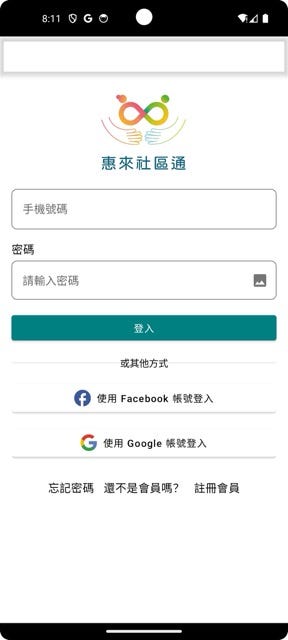
以下是程式碼的部分:
import android.annotation.SuppressLint
import androidx.compose.foundation.Image
import androidx.compose.foundation.border
import androidx.compose.foundation.layout.*
import androidx.compose.foundation.rememberScrollState
import androidx.compose.foundation.verticalScroll
import androidx.compose.material.*
import androidx.compose.material.icons.Icons
import androidx.compose.material.icons.filled.Image
import androidx.compose.runtime.*
import androidx.compose.ui.Alignment
import androidx.compose.ui.Modifier
import androidx.compose.ui.graphics.Color
import androidx.compose.ui.graphics.Shape
import androidx.compose.ui.res.painterResource
import androidx.compose.ui.text.input.PasswordVisualTransformation
import androidx.compose.ui.text.input.VisualTransformation
import androidx.compose.ui.unit.dp
import androidx.compose.ui.unit.Dp
import androidx.compose.foundation.shape.RoundedCornerShape
import androidx.compose.ui.draw.clip
import androidx.navigation.NavController
import com.example.huilaicommumity.android.R

@SuppressLint("UnusedMaterialScaffoldPaddingParameter")
@Composable
fun LoginScreen(navController: NavController) {
    var account by remember { mutableStateOf("") }
    var password by remember { mutableStateOf("") }
    var isObscureText by remember { mutableStateOf(false) }

    Scaffold(
        topBar = {
            TopAppBar(
                backgroundColor = Color.White.copy(alpha = 0.1f),
                title = { /* AppBar Title */ }
            )
        }
    ) {
        Column(
            modifier = Modifier
                .fillMaxSize()
                .padding(16.dp)
                .verticalScroll(rememberScrollState()),
            horizontalAlignment = Alignment.CenterHorizontally
        ) {
            Image(
                painter = painterResource(id = R.drawable.community_logo),
                contentDescription = null,
                modifier = Modifier.size(201.dp, 130.dp)
            )

            Spacer(modifier = Modifier.height(16.dp))
            Column {
                Text("手機號碼", style = MaterialTheme.typography.body1)
                Spacer(modifier = Modifier.height(5.dp))
                TextField(
                    value = account,
                    onValueChange = {
                        account = it
                    },
                    label = { Text("請輸入手機號碼") },
                    placeholder = { Text("請輸入手機號碼") },
                    modifier = Modifier
                        .fillMaxWidth()
                        .border(
                            width = 1.dp,
                            color = Color.Gray,
                            shape = RoundedCornerShape(8.dp)
                        )
                        .clip(RoundedCornerShape(8.dp)),
                    colors = TextFieldDefaults.textFieldColors(
                        backgroundColor = Color.White
                    )
                )
            }

            Spacer(modifier = Modifier.height(16.dp))

            Column {
                Text("密碼", style = MaterialTheme.typography.body1)
                Spacer(modifier = Modifier.height(5.dp))
                TextField(
                    value = password,
                    onValueChange = {
                        password = it
                    },
                    visualTransformation = if (isObscureText) PasswordVisualTransformation() else VisualTransformation.None,
                    placeholder = { Text("請輸入密碼") },
                    modifier = Modifier
                        .fillMaxWidth()
                        .border(
                            width = 1.dp,
                            color = Color.Gray,
                            shape = RoundedCornerShape(8.dp)
                        )
                        .clip(RoundedCornerShape(8.dp)),
                    colors = TextFieldDefaults.textFieldColors(
                        backgroundColor = Color.White
                    ),
                    trailingIcon = {
                        IconButton(onClick = { isObscureText = !isObscureText }) {
                            Icon(
                                imageVector = if (isObscureText) Icons.Filled.Image else Icons.Filled.Image,
                                contentDescription = null
                            )
                        }
                    },
                )
            }

            Spacer(modifier = Modifier.height(16.dp))

            Button(
                onClick = {
                    println("Login Action!")
                    // Implement login logic
                },
                colors = ButtonDefaults.buttonColors(backgroundColor = Color.Teal),
                modifier = Modifier
                    .fillMaxWidth()
                    .clip(RoundedCornerShape(8.dp))
            ) {
                Text("登入", color = Color.White)
            }

            Spacer(modifier = Modifier.height(16.dp))

            DividerRow()

            Spacer(modifier = Modifier.height(16.dp))

            Button(
                onClick = {
                    println("Facebook Login!")
                    // Implement Facebook login logic
                },
                modifier = Modifier
                    .fillMaxWidth()
                    .clip(RoundedCornerShape(8.dp)),
                colors = ButtonDefaults.buttonColors(backgroundColor = Color.White),
            ) {
                Image(
                    painter = painterResource(id = R.drawable.facebook_icon),
                    contentDescription = null,
                    modifier = Modifier.size(24.dp)
                )
                Spacer(modifier = Modifier.width(8.dp))
                Text("使用 Facebook 帳號登入", color = Color.Black)
            }

            Spacer(modifier = Modifier.height(16.dp))

            Button(
                onClick = {
                    println("Google Login!")
                    // Implement Google login logic
                },
                modifier = Modifier
                    .fillMaxWidth()
                    .clip(RoundedCornerShape(8.dp)),
                colors = ButtonDefaults.buttonColors(backgroundColor = Color.White),
            ) {
                Image(
                    painter = painterResource(id = R.drawable.google_icon),
                    contentDescription = null,
                    modifier = Modifier.size(24.dp)
                )
                Spacer(modifier = Modifier.width(8.dp))
                Text("使用 Google 帳號登入", color = Color.Black)
            }

            Spacer(modifier = Modifier.height(16.dp))

            Row(
                verticalAlignment = Alignment.CenterVertically
            ) {
                TextButton( onClick = {
                    println("忘記密碼!")
                    navController.navigate("ForgetPasswordPage")
                }) {
                    Text("忘記密碼",color = Color.Black, style = MaterialTheme.typography.body1)
                }
                Spacer(modifier = Modifier.width(5.dp))
                Text("還不是會員嗎?", style = MaterialTheme.typography.body1)
                Spacer(modifier = Modifier.width(5.dp))
                TextButton(onClick = {
                    println("註冊會員!")
                    navController.navigate("RegisterPage")
                }) {
                    Text("註冊會員",color = Color.Black, style = MaterialTheme.typography.body1)
                }
            }
        }
    }
}

@Composable
fun DividerRow() {
    Row(
        verticalAlignment = Alignment.CenterVertically,
        modifier = Modifier.fillMaxWidth()
    ) {
        Divider(
            color = Color.Black.copy(alpha = 0.1f),
            modifier = Modifier.weight(1f)
        )
        Text("或其他方式")
        Divider(
            color = Color.Black.copy(alpha = 0.1f),
            modifier = Modifier.weight(1f)
        )
    }
}
好了,以上就是稍微做一點UI,嘗試一下整個Android Studio+Jetpack Compose在建構的時候的感覺。
小結
其實真的跟Flutter沒什麼差別,就是可能元件的名稱不太一樣,但在使用上基本是大同小異,不過Android Studio也是run起來需要很多環境的毛需要順一順,接下來可能會講一些跟ViewModel有關的東西,不過應該是不會太OOP,可能聊聊事件流,那麼就明天見囉!


